Master Paint
Masters being a hardware store expanded their range to include paints.
A brand identity was required for the expansion of the company paint range.
Logo Design
Branding
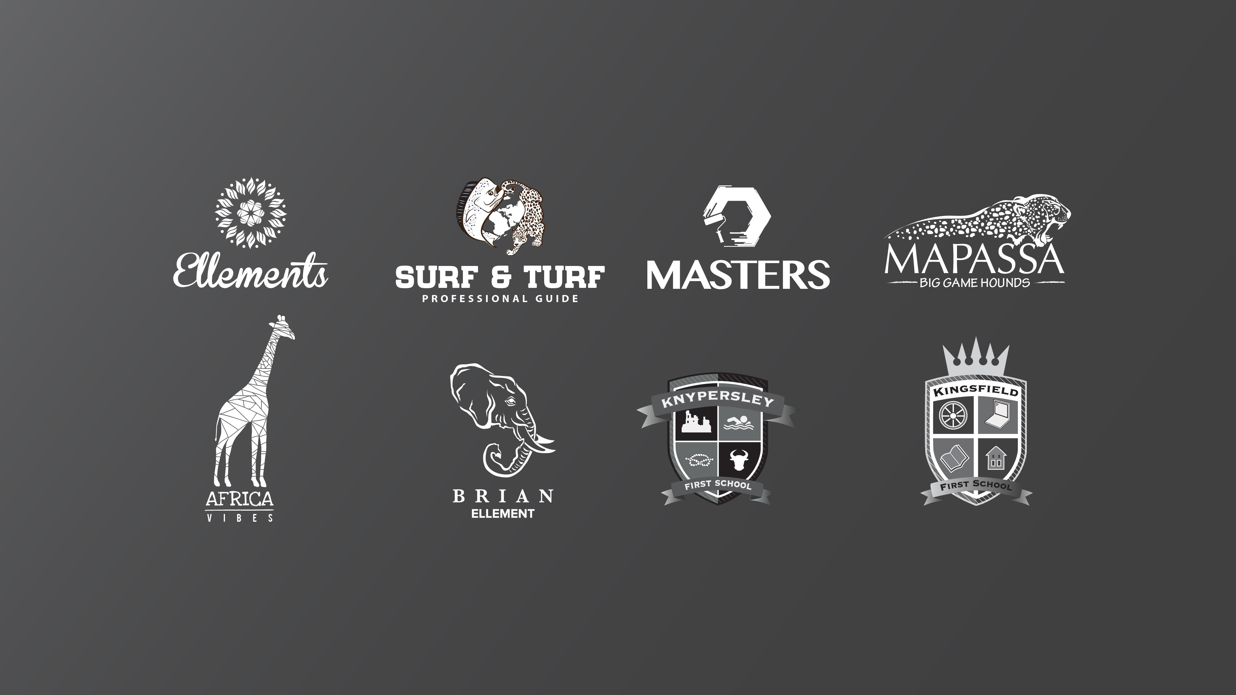
The branding was inspired from the Masters website where their look and feel was an octagon shape water mark background. Through incorporating the octagon shape with a paint roller and an edge effect developed a strong bold
paint logo.
paint logo.
Super Cover Design
One of the paint variety’s is the Acrylic paint range that is called the Super Cover acrylic.
Masters Paint Icon
The informative icons are designed for the instruction to be easily followed for the paint tubs of the
Master Paint Tub Design.
20 Litre Tube Design
Multiple size tub designs for the different paint ranges are developed from the brand identity and
style. This is a 20 liter design sticker for the Super Cover paint range.
style. This is a 20 liter design sticker for the Super Cover paint range.
