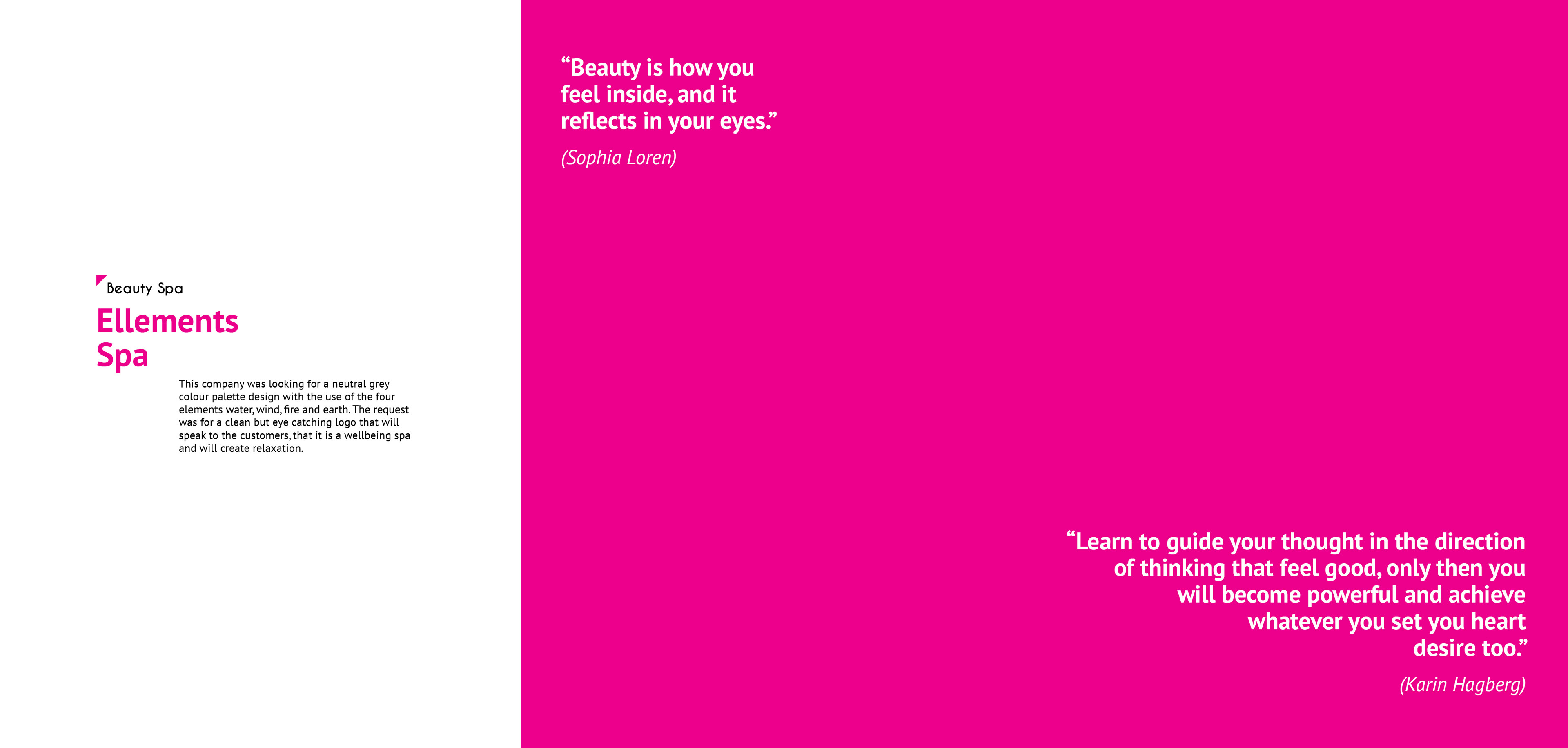
Ellements Brief
This company was looking for a neutral grey colour palette design with the use of the four elements water, wind, fire and earth. The request was for a clean but eye catching logo that will speak to the customers, that it is a wellbeing spa and will create relaxation.
Brand Identity
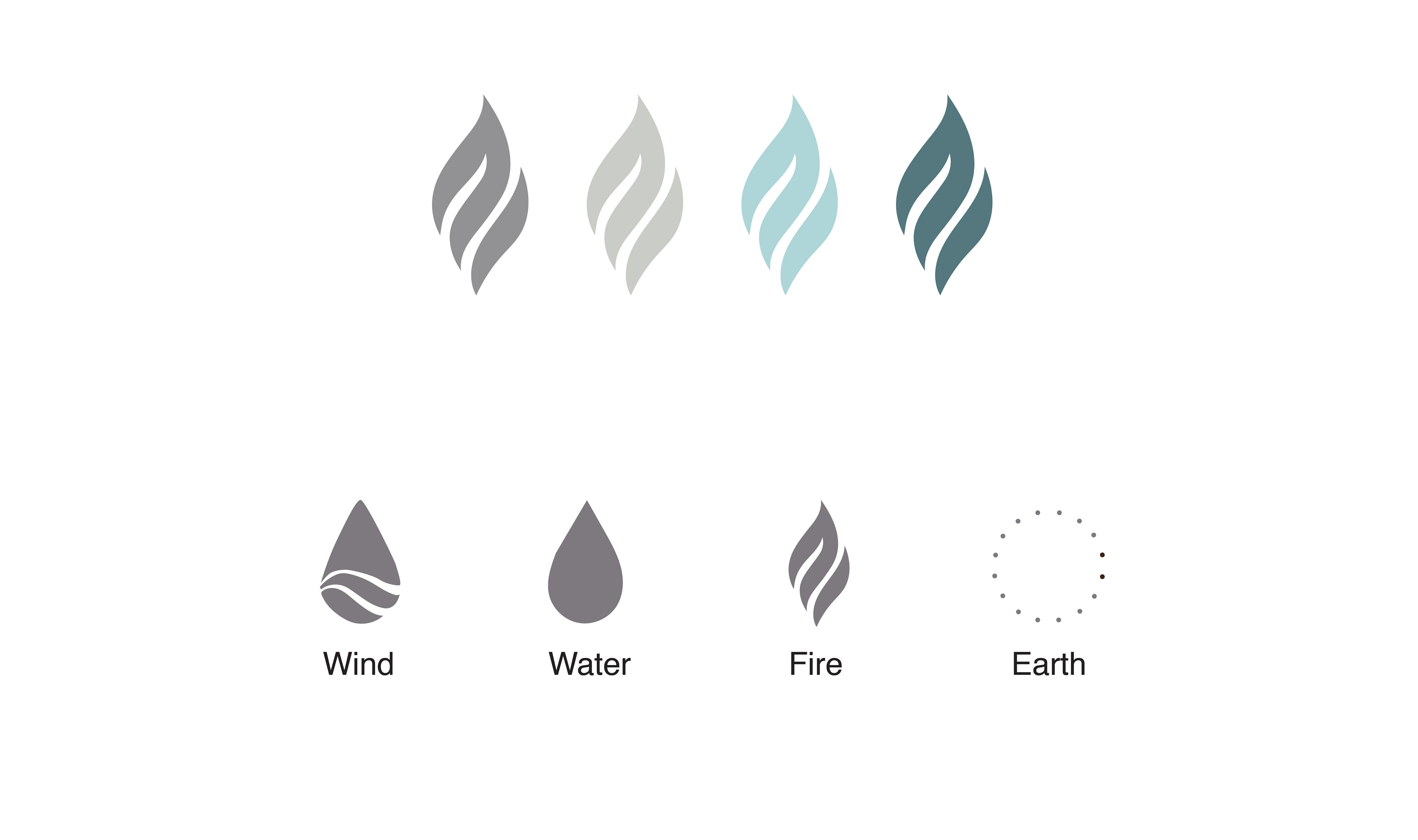
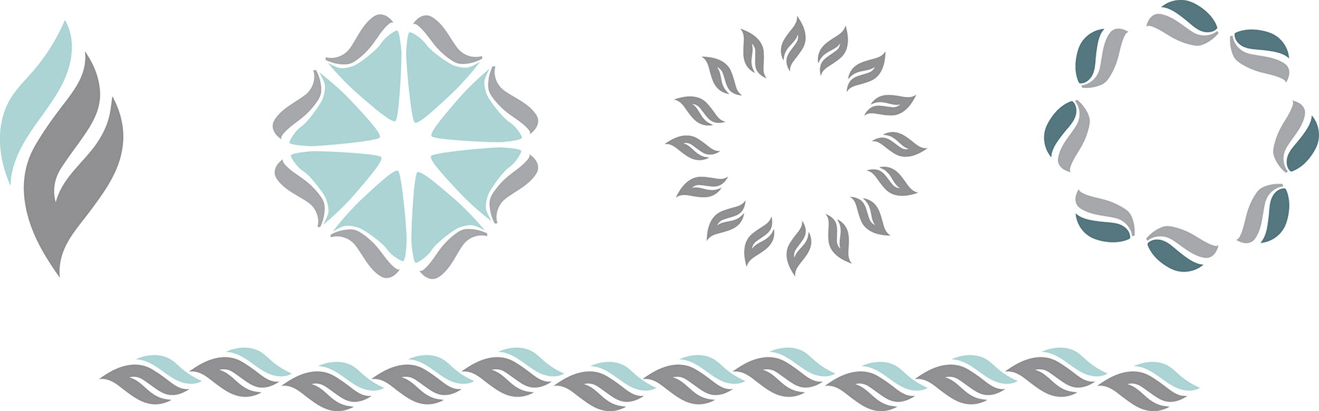
The visual identity of the brand was developed from the clean vector shapes that emphasised the four different elements fire, water, wind and earth.
Logo Design
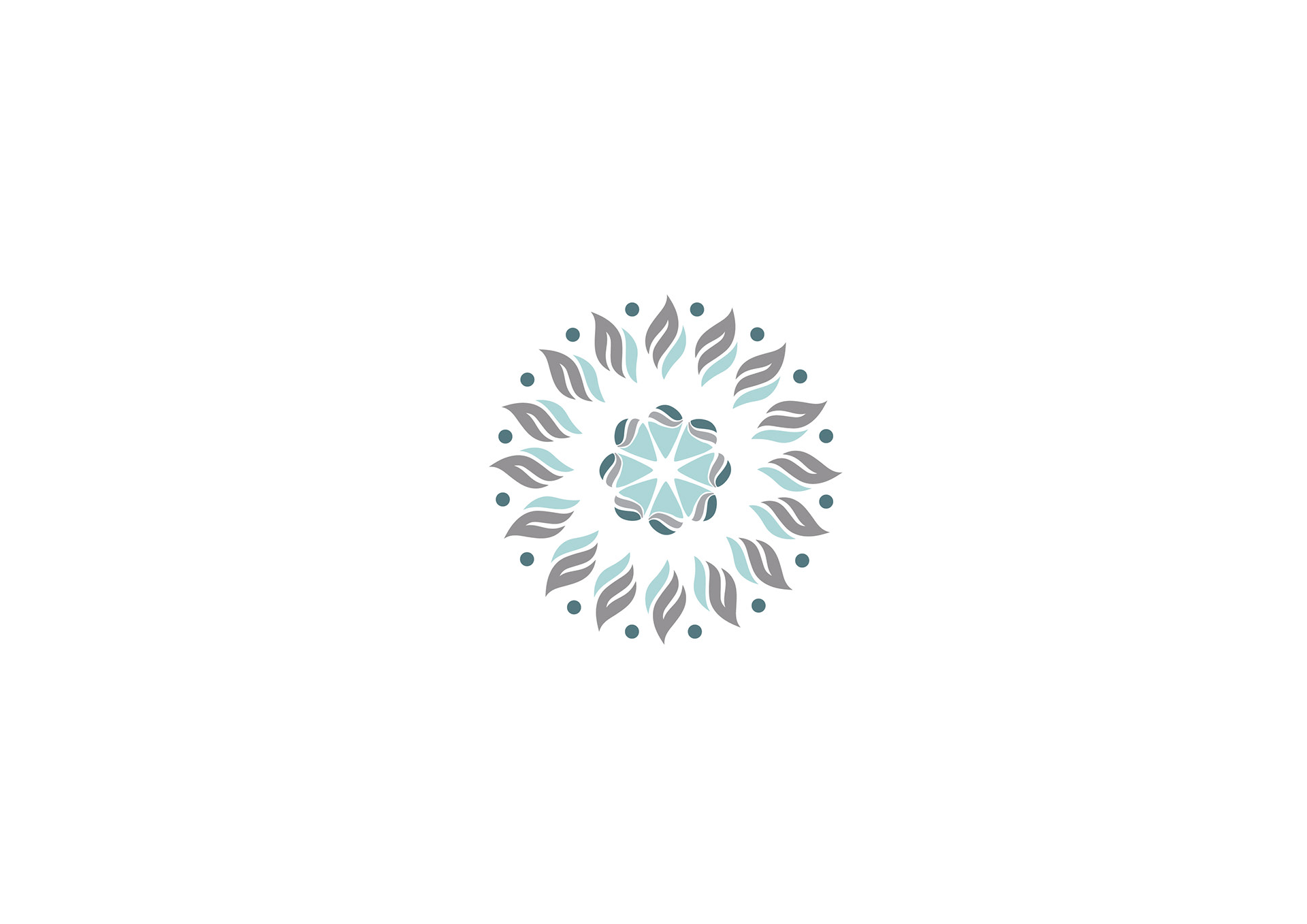
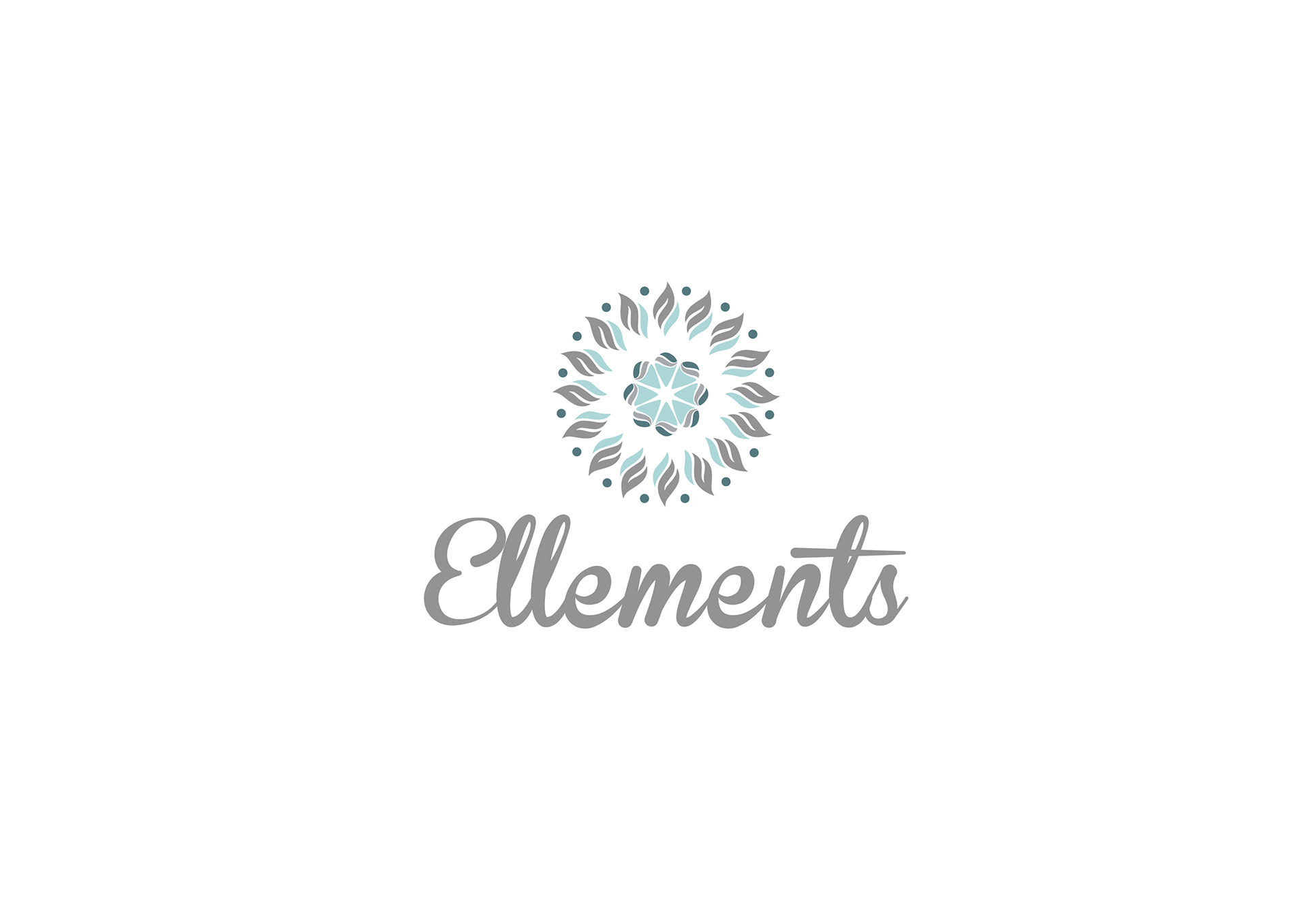
The logo was inspired from the rhythm flowing of the four element symbols. A uniformed logo creates a harmony of relaxation and brings interest into the meaning behind the logo.
Business Cards
The patterns the can be developed from the brand identity can be used in different aspects of design throughout
the branding stationery.